Understanding CSS Grid the Right Way
A practical, use-case-driven walkthrough of CSS Grid — from grid-template-columns and fr units to grid-area layouts and responsive grids without media queries.
As a frontend developer, my most common enemy was CSS grid, as it has lots and lots of properties, so remembering all of them was a nightmare for me. So I used to ignore grids and, most of the time, reach for my friend FLEX box. Until I finally challenged myself to come out of my comfort zone and understand grid.
Now, to understand grid properly, we need to first understand how not to learn grid.
The answer is simple: do not try to memorize all the properties, rather break down each thing based on the use case. This is the same thing we will do in this blog post. We will create a few use cases and then try to create those layouts by using grid. Doing this, we will learn the most important elements of grid and also understand grid properly.
So take a cup of coffee or tea or a diet coke and let's dive into it.
When to use grid?
Okay before we jump into the properties, let's answer the real question first: when do you even reach for grid instead of flex?
Here is the simple way I think about it now.
Flexbox is one-dimensional, it's great when you are laying things out in a single row or a single column.
But the moment you start thinking in both rows AND columns at the same time, that's your signal to use grid.
A few real examples:
- Building a dashboard with cards of different sizes? Grid.
- A simple navbar with logo on the left and links on the right? Flex, don't overthink it.
- A photo gallery or a bento layout where items span multiple rows and columns? Grid, no question.
- Centering one single item inside a box? Flex is honestly less code.
So the rule of thumb I follow now is: if I am arranging things in a line, flex. If I am arranging things like a table or a magazine layout, grid.
That's it, that's the whole decision tree, don't make it harder than that.
Now let's get our hands dirty and actually build stuff.
Grid Basics
Let's imagine we have multiple cards with the same width and height, and we need to display them in a grid container.
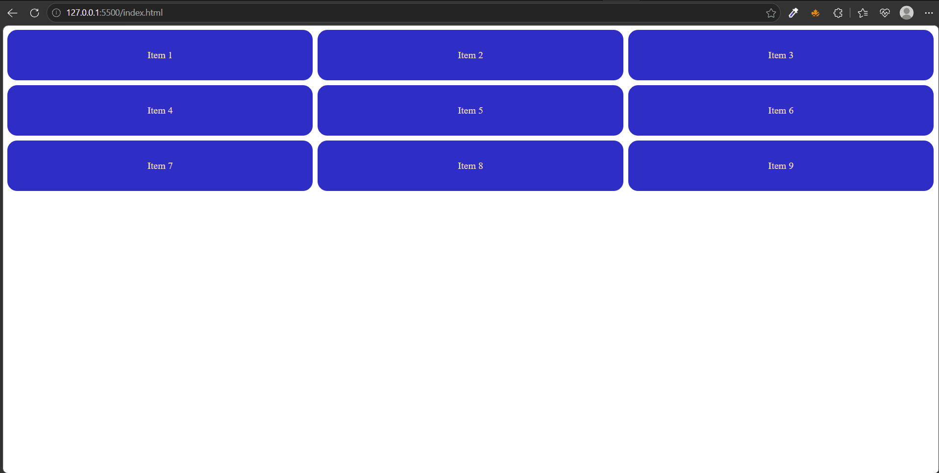
First, let's build the basics:
Now let's make them grid.
Visually this will not do anything. But it made your container a grid.
Now you can see there is a gap of 8px between each item. We are cooking now.
Let's now go into the inner workings of grid.
How many columns and rows do we need to represent the layout?
Grid Template Columns
Let's first define the columns. Take an example of 3 columns, each with 200px width.
This will do the job for us. Now you can see in the first row we have 3 columns, so 3 items sit there. But what about the other items?
You can see they automatically created 2 new rows and shifted the other items there. So technically we don't need to define rows here. I will come back to rows later in this blog.
Okay, let's move on. Now I want to make my container take up the full screen width as per the image, so how do we do that? It's pretty simple, use fr instead of px.
What does 1fr do? Think of it like a fair judge of court:it treats everyone as equal.
"Take whatever free space is left after subtracting fixed sizes, gaps, padding, borders, etc., then divide it according to these ratios."
Let's go off track for a minute. Let's say I want the middle card to take up more space than the other two. So we can simply do this:
What it does is:
Divides the available space into 4 equal fractions, then distributes them according to the ratio.
Step 1: Add all the fractions
So the container is split into 4 equal parts.
Step 2: Assign the parts
Okay, now let's get back to our example. This works, but I am lazy, I don't want to write 1fr three times. So what is the solution?
CSS provides us with a function called repeat().
It takes two arguments:
1.The first argument tells CSS how many times to repeat the pattern. 2. The second argument can be a single value or a pattern of multiple values. CSS repeats the entire pattern, not each value individually.
This will create the exact same layout.
Explicit vs implicit grid:
We will come back to repeat in a minute. Now let's understand what explicit vs implicit grid is with rows.
Let us now define 3 rows with 150px height each.
Okay, this will work fine, but let's take a real-life example.
Let's say we are rendering a list of search results in this layout. Now, till now we have had a constant number of items. But in search results we don't know how many items we will have. Let's add 2 more items to our HTML,
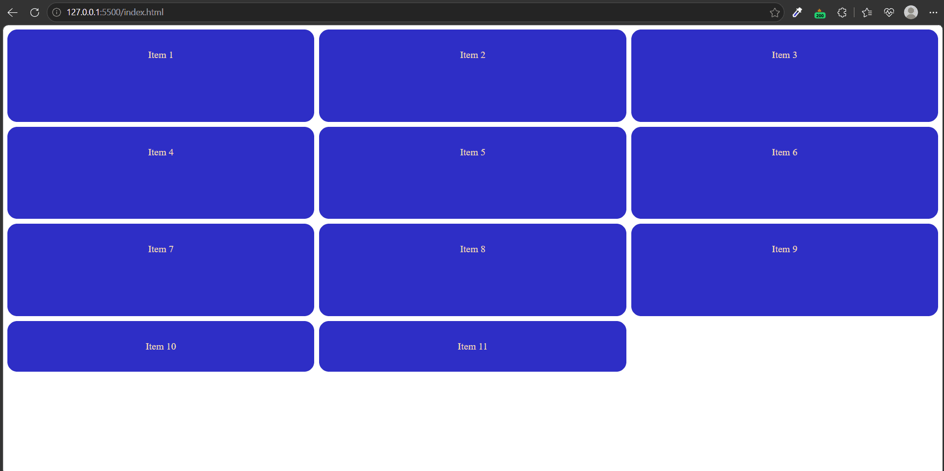
Snap! You can see there is a new row created, but the height is not matching with the other rows, because in our repeat function we only defined 3 rows with 150px height each. If the browser needs to create more rows, it will give them the height auto.
Now how do we fix this?
Here comes another property: grid-auto-rows.
This will tell the browser that whatever extra rows you are going to create should have the same height of 150px.
Notice in the code that I have removed the grid-template-rows: repeat(3, 150px) line completely, as we don't need it because of this new grid-auto-rows property.
Let's take a pause here to learn another property. You can see I am saying throughout the blog that if there is an extra item, the browser will create a new row and shift the extra items there.
But the browser doesn't do it automatically, this is also handled by a property called grid-auto-flow. By default the value of it is row, that's why the browser creates a new row. If we change it to column, then you can see everything is set in an extra column.
Where should we use it? We can use it if we want to create a carousel of images with horizontal scrolling.
Grid Advance
Okay, we have covered most of the basic useful properties of grid. Now let's get into some deeper concepts. For this section we want to create a beautiful bento grid.
Here we will also look at how we can make it responsive as well. For this I want to use the example from this indepth video of Kevin Powell.
Here is what we are going to build.
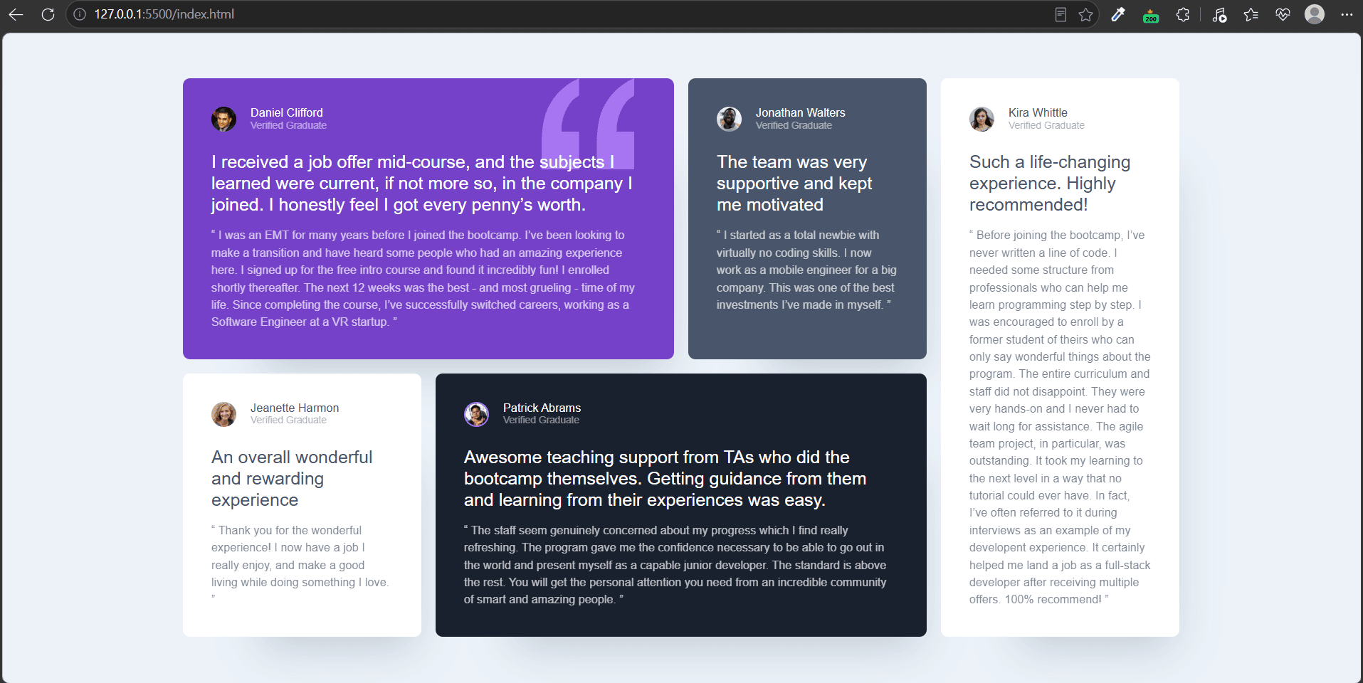
This is the full HTML code.
Now let's start styling it.
If we only do this, then it will work properly on mobile, we don't need to do anything else.
But now let's design it for desktop screens:
This will create 4 columns and place 4 testimonials side by side and keep the last one on the second row.
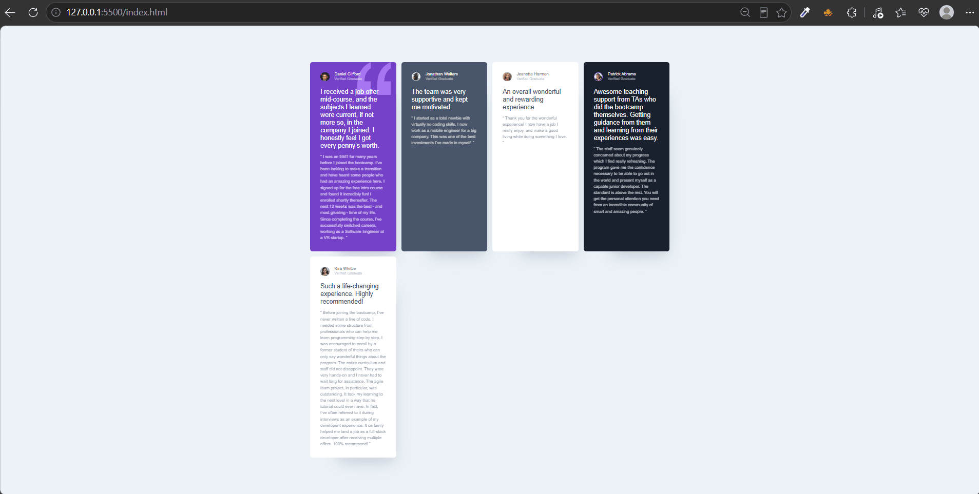
Now let's design the first item. As per the design it should take 2 columns. So how do we do it? Here comes a new property again, grid-column.
What is this property? This is a shorthand property of the below properties.
This means this item will start from the 1st column and end at the 3rd column.
You might think it is taking 2 columns, so why are we giving the end value as 3?
grid-column: 1 / 3 doesn't mean "columns 1 through 3" — it means "start at line 1, stop at line 3," which spans exactly 2 column tracks (the space between lines 1-2, and 2-3). So in these properties we are not actually mentioning the column number but the line number.
Okay, this works perfectly fine. But can we improve it?
You can see in the main image there is another item, i.e. Patrick's testimonial, that is also stretching two columns. Now if we want to style it, we need to find out the exact column number for it and then design it, which is kind of a bad approach, so there is a better approach.
We’ve created a new class called grid-col-span-2, which we'll apply to both the first testimonial and Patrick's testimonial.
The important part is the value of grid-column: span 2;. It tells the browser to make this item span 2 columns. It doesn't specify which two columns—that's up to the browser, which determines the placement based on the surrounding grid items and the available space.
Now let's do the final part. The testimonial of Kira should be stretched 2 rows at the end of the container, which is the 4th column. So for column we will do grid-column-start-4, this places the item in the 4th column.
Now, for stretching it to 2 rows similar to above, can we do grid-row:span 2?
If you say yes, then you made the same mistake as I did while learning this.
Because this is wrong and this will not give us the expected result. As the value span 2 will span this item to 2 rows from the row it is already placed, that is, the second row. So it will start at line 2 and end at line 4.
So we need to fix it, and it's pretty simple.
See, here we have added the value 1 in grid-row-start and shifted the value span 2 from grid-row to grid-row-end. We can also give the end value as 3 and it will work exactly the same.
Or we can also use the shorthand property like this:
Hooray! We finally completed the layout.
Now let's move on to the most exciting part—the technique that makes creating bento grids and other complex layouts much easier.
The Area Weapon
For this we will use a different layout example.
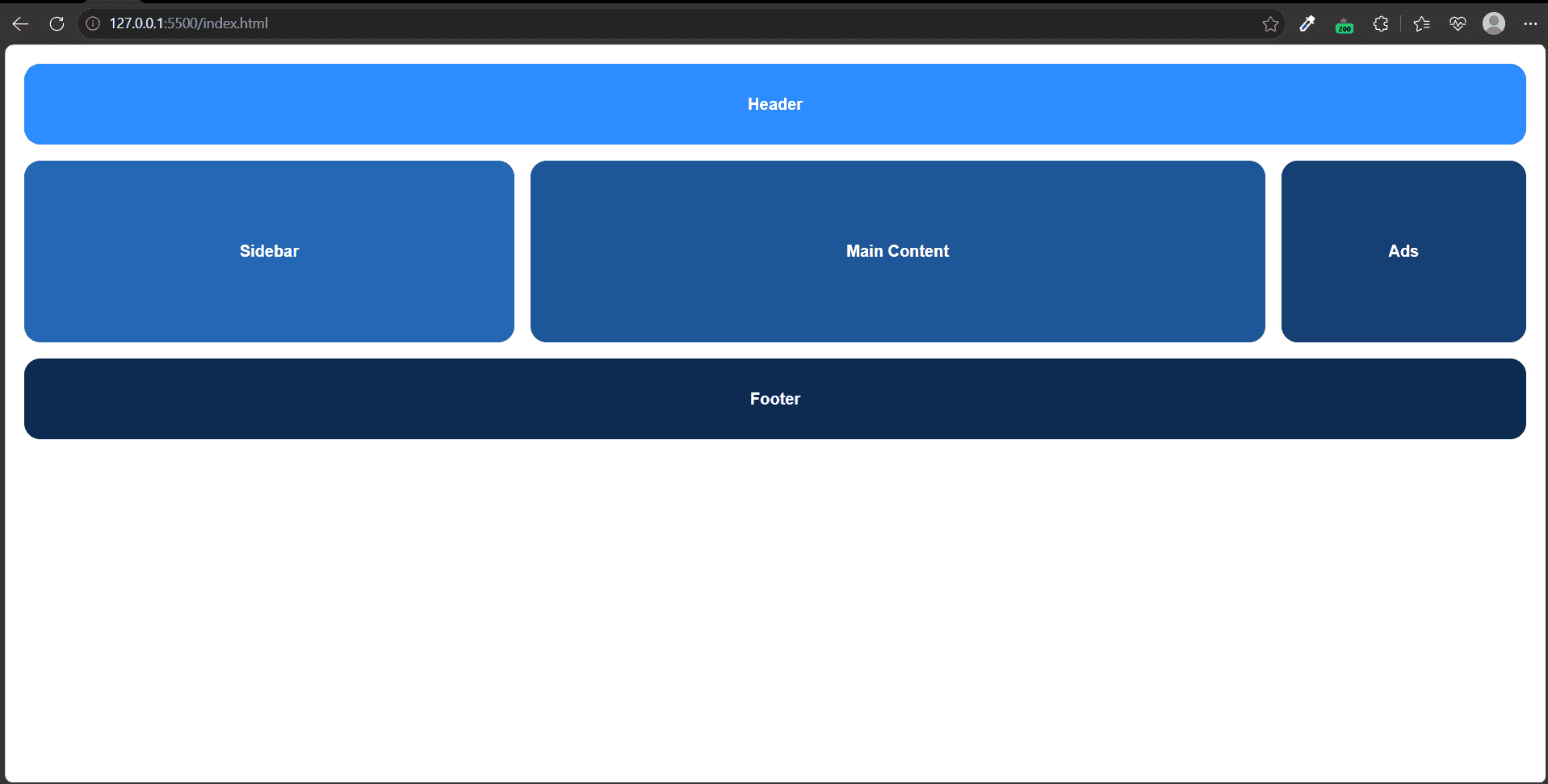
From the image, we can see that our layout needs 3 columns, as the second row contains three items.
One important thing to notice is that these three items have different widths. The second item is wider than the first, and the first is wider than the third.
Let's create that using CSS Grid:
Okay, our basic layout is ready, but now let's see how we can spread the header and footer across all 3 columns.
For this we need to treat each item as a separate area and give each of them a separate, recognizable name, by using a simple grid property called grid-area
Now we just need to tell the parent container that, in each row, which area should be placed in which column.
Boom, our layout is ready!
If we break it down, we're simply telling the browser:
- In the first row, place the header across all the columns.
- In the second row, place the sidebar in the first column, the content in the second, and the ads in the third.
- Finally, in the last row, place the footer across all the columns.
Responsive grid without media queries
Till now I used media queries to make things responsive, but there is a way we can achieve responsiveness without using media queries in grid.
How? Let's understand that.
We are going to build this:
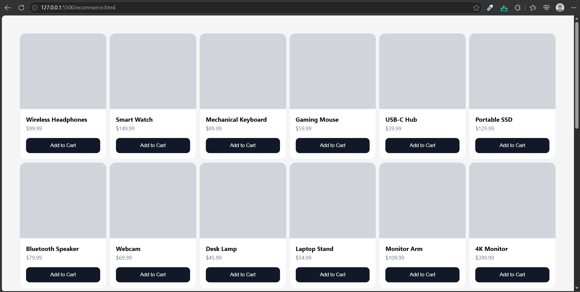
Okay, let's give the main container a class name products and make it a grid.
Now let's first build the desktop version.
We decided not to use media queries, so I added grid-template-columns: repeat(5, 200px) directly to the .products class, outside of any media query.
This creates 5 columns, each 200px wide, which looks great on larger screens.
But on smaller screens, the grid will overflow because there isn't enough horizontal space.
So, how do we solve this?
To fix this, we simply change the value of grid-template-columns to repeat(auto-fit, 200px).
Now, instead of always creating 5 columns, the browser automatically figures out how many 200px columns can fit in the available space and creates only that many.
Okay, this makes the layout responsive, but it introduces another problem.
Let's say the viewport is 768px wide. At that size, the browser can fit 3 columns of 200px each, which takes up about 600px. After adding the gaps, the total width becomes roughly 632px. (This is just an approximation—you'll understand it much better once you try it in the browser.)
That leaves a chunk of unused space on the right, making the layout look awkward.
So, how do we fix this?
That's where minmax() comes in.
As you can see, minmax(min, max) takes two values. It tells the browser, "Never make this column smaller than min or larger than max."
In our case, each column will never shrink below 200px. If there's extra space available, the columns will grow together to fill it, up to the maximum value we specify.
And that's it! Our layout is now fully responsive without using a single media query.
But before I say goodbye, there's one more keyword you should know about: auto-fill. It behaves almost the same as auto-fit, but with one important difference.
Let's say the viewport is 900px wide. How many 200px columns can fit?
Roughly 4 columns (900 ÷ 200 ≈ 4). So both auto-fit and auto-fill will create 4 columns.
Now imagine we only have 2 grid items. This is where they behave differently:
auto-fitcollapses the two unused columns and stretches the existing two columns to fill the available space.auto-fillkeeps all four columns, even though only two contain items. The two empty columns remain in the grid, so the existing items don't stretch to fill the extra space.
This is it! I think we've covered most of the important concepts in CSS Grid.
There are still a few topics left—like subgrid and alignment—which I'll cover in the next blog.
Until then, play around with the examples, build a few layouts on your own, and most importantly, practice.
See you in the next one. Byeee! 👋